Debunking Nue CSS
An in-depth analysis about the bold claims made by Tero Piirainen about his new release, Nue CSS.
Published on 12th April 2024
What is Nue CSS?
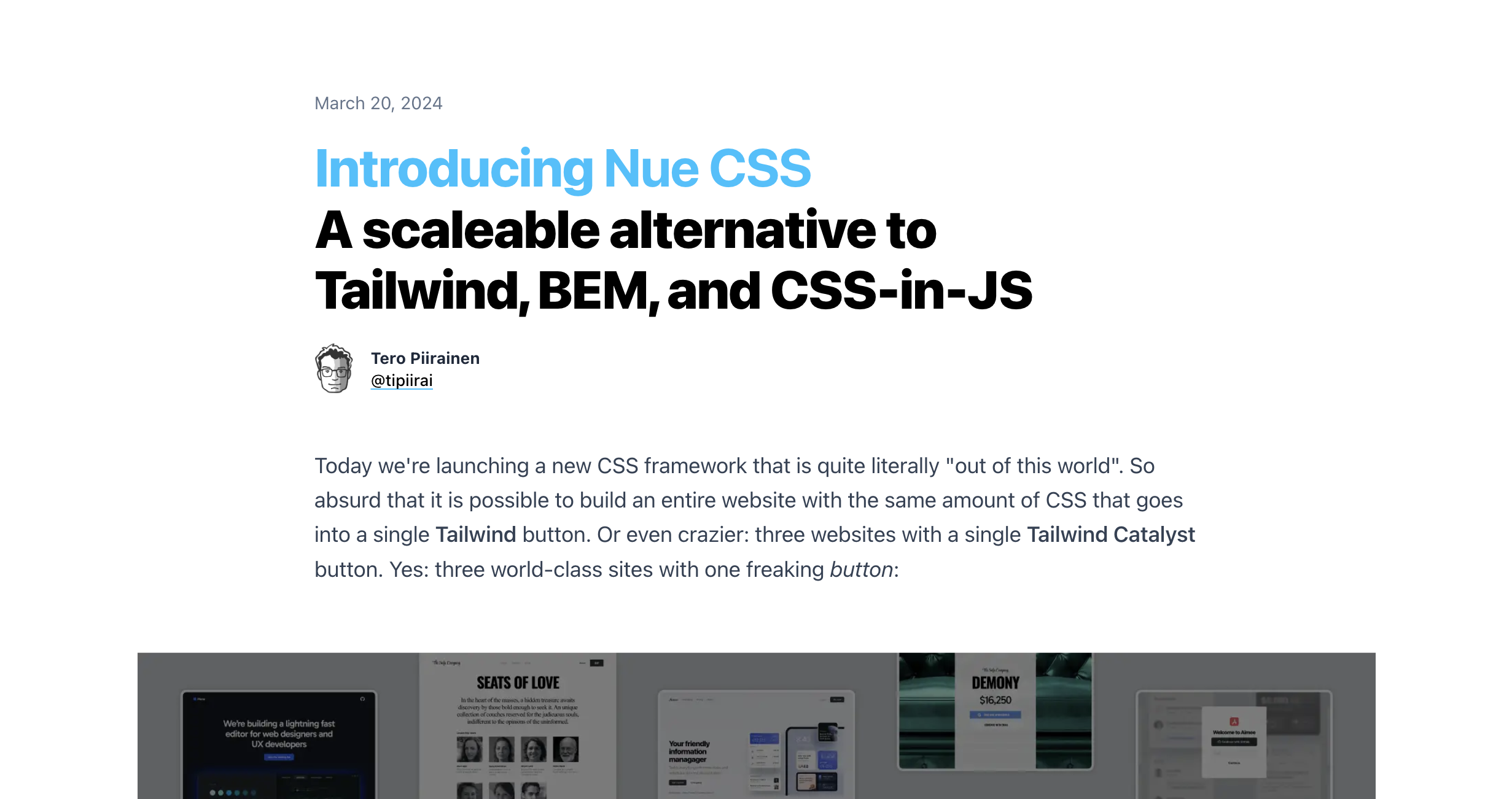
Nue CSS is the latest release of the web framework Nue. It is created by Tero Piirainen, who is (in)famous for their bold statements about the web.1
As such, the announcement for Nue CSS couldn’t be any different. There are a number of claims that I’ll be putting to the test here.

But, what is Nue CSS exactly? It seems to be a way of thinking about CSS, rather than a library. Before getting to it, the article goes through existing methodologies, such as BEM, CSS-in-JS, Tailwind (Tero’s mortal enemy, after Adam Wathan famously stole their lunch money)2, and states their tradeoffs.
So what’s the magical solution? Nue CSS, of course!
The author quotes big names, such as Steve Jobs, and Dieter Rams, to explain how its all too simple: You should define a design system, and make it simple. Then you don’t have to define a lot of classes or properties!
There’s not much else to it, really. It doesn’t tackle much about scale, conflict resolution with naming, etc. When looking into one of the templates, Aimee, the CSS is actually quite lean. You have some global files, and then some unique css files per page. That’s it.
One line of CSS is easier to maintain than a hundred lines.
It does makes me wonder why they didn’t just added scoped styles, which would still have all the benefits they’ve mentioned, without having to worry too much about naming.
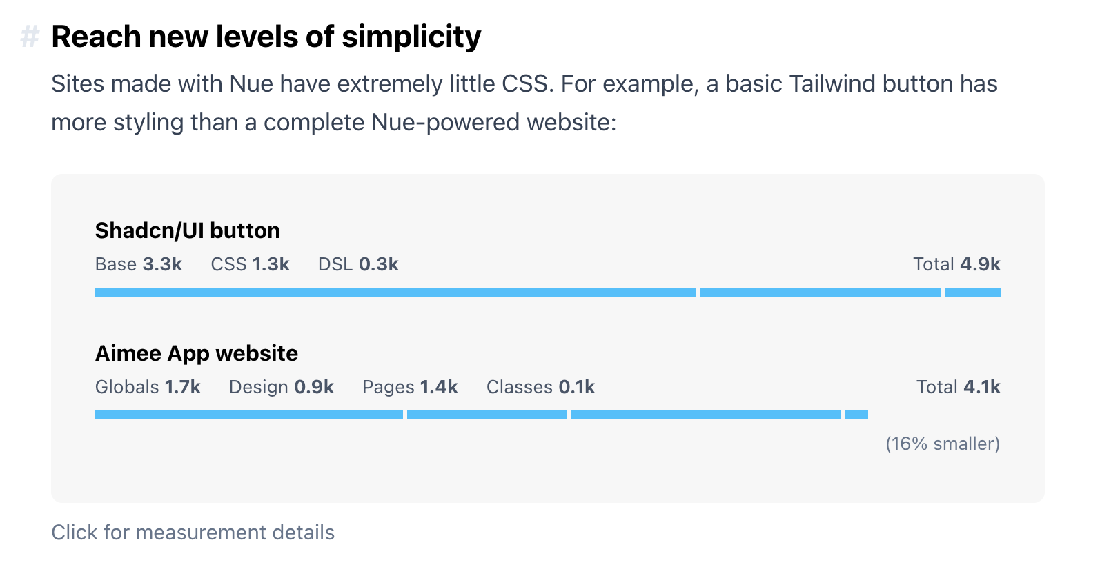
Nonetheless, with such minimalism, Tero claims there are huge benefits to performance.

Let’s stop right there for a bit.
Tailwind Button vs Nue CSS template
The comparison is made on bad faith.
It includes the base part of Tailwind, including the preflight, which is optional.
It also ignores an important fact: As your site grows, Tailwind requires less newly-generated CSS by design, something which is hard to achieve traditionally.
A button in isolation may be quite hefty, for sure. A button within other Tailwind buttons, however, is quite small, smaller than traditional CSS. I have an experiment about this here.
Even so, I decided to remove the preflight, and include only the necessary classes for it: Tailwind Playground
It’s much leaner now, with the CSS going to 814 Bytes, and reducing the size of said button to about the size of the template’s CSS.
And that’s not all, Aimee’s CSS file size is actually bigger, at least when I measured locally. It comes in at 5644 bytes total.
So the claims don’t exactly hold up.
Building fast websites!
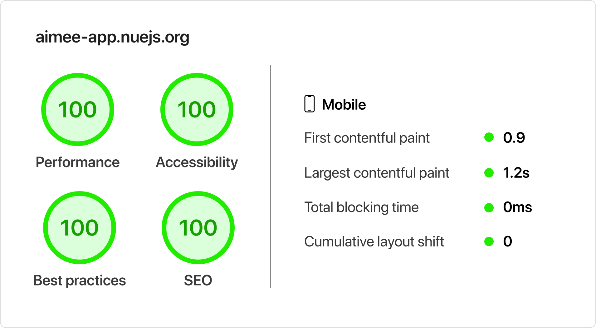
Tero uses an approach for Nue CSS that’s interesting. It all gets inlined in the HTML. They claim this gets you to a performance level that cannot get achieved with a normal bundler.

Good thing I recreated the template in Tailwind and Astro, and I got similar results! Only SEO wasn’t at 100, because I couldn’t be bothered to do it. I’ve published the recreation if you want to see for yourself.
So yes, their approach is fast, but the claims about others being slow, doesn’t hold up as a rule. You can build slow websites with any tech-stack, and it definitely is possible to build fast websites with Turbo-Infuced-Rust-Bundler powered stacks.
Besides, there are other things that are really important in building websites, that Tero overlooked when building these templates.
Troubles in Nue-land
When playing around with the Aimee template for my recreation, I noticed several issues.
- It applies
role="button"to an anchor tag, which is a misuse of a11y attributes. - The
alttags for some images are severely lacking- Some images don’t even have alt tags!
- Not all links have discernible text
- Fails WCAG compliance in colors throughout the website
- The
dialogelement is being misused. Rather than trigger it using JS, it uses some “clever”3 CSS to display it. This makes it so focus-trapping, and other default dialog behavior gets totally ignored, which is an accessibility and usability nightmare. - Repeated unnecessary markup, contributing to page bloat.
- The CSS gets quite hard to follow. Some elements are affected by multiple different files, making it difficult to grasp which styles are being applied where.
- Typos! I’m sure someone will find a typo in my site too, this is just a nitpick 😈
I point these out because I think its important that a template should serve as a good starting point, and as such these faults should not be ignored.
Unfortunately, this is common-place in the web. Accessibility is hard and engaging people to improve it is even harder.
Scalability
Okay, so I lied. Tero does mention scalability, but not in the way you’d expect.
They say Nue CSS helps you with scalability, by offloading the responsibility from one single JS/React developer, and shifting it to UI/UX developers.
What Tero doesn’t mention though is, for the latter developers, how does Nue CSS scale for them? There’s no mention of it whatsoever.
I’m only left to guess that either
- A. They didn’t think about it or
- B. They thought it wasn’t a valid concern for this approach
Either option is shortsighted. Designs gain complexity over time, and managing them is tricky.
Unless Nue CSS is only suitable for simple projects, which would definitely make it unscaleable.
Other mentions
Tero talks about how vanilla CSS stands the test of time, and is forever understandable, ignoring that best-practices and commonly-used properties shift constantly.
Have you seen people using float a lot these days?
With the ever-growing list of CSS features, the way we write CSS will constantly change, and things will become legacy. Such is the nature of things.
I’m also quite eager to see their plans for a global design system, pitched by Brad Frost. Its one of the next big things in the Nue roadmap.
Tero thinks its the next big thing in CSS, even though Brad mentions it shouldn’t care about styling too much.
Nonetheless, it’s an exciting idea, for which I have some plans of my own…
Closing Notes
It’s become evident that it’s hard not to get dogmatic about our tech stacks.
Twitter threads and Reddit ramblings are a sore-but-common sight, where people grumble and fight about why everything else but their own choice sucks, and we get obsessed with trying to prove the other side wrong with benchmarks, Lighthouse scores, or any other way of keeping ourselves in a bubble.
I try and approach these with a more sober view.
Things rarely do suck as badly as people say. Frameworks and libraries were built for a purpose, and have thought behind it, they’re not built on a whim!
They all start with a single purpose: to solve a problem.
That’s true for Nue as well. Even though I refute a lot of Tero’s claims, it does have its own merits. It’s quite fast and minimal, making it a good fit if you’re looking for that above all else.
So instead of trying to shit on others to try and make your preferred weapon of choice look good,
solve the problems you find, and people will come to you.
Besides, if we’re all still making un-accessible messy websites no matter the stack, I say we have more important matters to address.
This is the first article I’ve published on my new website.
I’ve been wanting to do this for quite a long time. Even though I’ve wondered if many people would even see it, I guess it’s also a way to put order to my thoughts.
It’s also great fun!
I’d love to discuss about the points above, including with Tero.
Feel free to reach out at any time!
I also linked some resources I love below about styling and accessibility, which I believe will help you build great websites.
Thank you.
Notes & References
- Some examples of bold statements: Tailwind marketing and misinformation engine, Rethinking Reactivity (not the one by Rich Harris, duh)
- This is a joke, don’t take it too seriously.
- Clever is in quotes here due to the fact that this is a hacky solution, providing no benefits unless used with progressive enhancement in mind.
Resources
- Cube CSS, a CSS paradigm by Andy Bell which mixes traditional CSS with utility classes
- Build Excellent Websites, also by Andy Bell
- Practical Accessibility, an excellent a11y course by Sara Soueidan
- Deque’s Web Accessibility Checklist
Let me know if there are other resources you’d recommend here.